
Your church website is one of the first stops a potential guest will make. Before setting out on a Sunday morning to check out their first worship service with you, they will check you out online. After working with several churches and looking at best practices, we found three website mistakes churches make – and may not even realize it.
I’m going to assume here that if you are reading this, you want to reach new people in the community. That reaching the lost, dechurched, unchurched, those who have fallen away – however you want to say it – is a priority to you and your leadership team.
Here are three mistakes to look for on your site that may deter site visitors from becoming church visitors.
And as I’m not one you leave you hanging, you’ll also find my recommendations on how to address them. Let’s get to it!
Website Mistake #1: Not visitor-focused
Church has a unique vocabulary. Nothing makes someone feel more like an outsider, like they don’t belong, than not understanding what you’re talking about. If you’ve grown up in church or work in ministry, you are familiar with words like discipleship and sanctification. Older churches have a narthex (probably my all-time favorite church word since I was a child). We all have attended another church and have encountered something like, “New Beginnings meets Wednesday nights in the Shepherds room.”
If your home page has words like these, your site visitor will feel disconnected and less likely to come to visit your church.
Potential visitors come to your site to better understand what your community is like and to find information like location and service times. They are interested in taking the next step! They shouldn’t have to scroll through info about the upcoming church council meeting or other insider information to find it. Physical location, worship times, and maybe a bit about what to expect should be easy to find and use easy-to-understand language.
Being visitor-focused on your site doesn’t mean you shouldn’t have helpful member information on there. That’s going from one website mistake to another! It absolutely should be a resource for signing up, finding out about new classes, and more! Give thought to your site menus and layout. Think of your site as a path you want to take someone on. This planning process helps you to prioritize space, meet visitors where they are in their faith journey, and take care of your congregation.
Website Mistake #2: Not mobile-friendly
Ever received an email or a social media post with a link to find out more – only to find that the page is laid out for desktop only? I know I have! It’s kinda crazy that this still happens, and yet it’s easy to do.
More than likely, you build webpages on your desktop/laptop. We can forget about the mobile experience when building on a different device.
Right now, I want you to take a time out. Pull up your website on your smartphone. Just looking at your home page, how does it feel to you? Can you read the text? Are words cut off? Pinching, expanding, cut off words, and more leave a site visitor feeling less excited about you.
Just how important is the mobile experience?
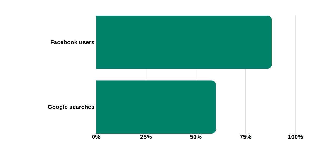
Consider how users of Google and Facebook use their mobile devices. 60% of Google searches are on mobile devices. 88% of Facebook users access it through a mobile device. Aside from word of mouth, these sites are how potential visitors are finding your church website. And the majority are looking at your website for the first time on their phone. I’d say the mobile experience is key.
To address this, add mobile design to your page build process.
Web development platforms vary widely, yet most do have mobile responsive design now. Thinking about mobile will significantly improve the mobile experience and help potential visitors both find what they need and feel good about getting the info. Hint: which also means you’ve helped them and you haven’t even met them yet!
You should also send the page link to yourself and perhaps a few other people to see how it looks on an actual phone. Adjusting fonts and text size at this point helps a ton towards making the site visit easy and enjoyable.
Right-size your photo and video files
File sizes of your images and embedded videos also affect the mobile experience. Phones pull in webpages either from WiFi or data plans. Both of which have varying levels of speed. Large file sizes from photos or videos hurt your page (and collectively, your site) in two ways.
One, people are impatient. Too slow to load, and your visitor may leave before they read your information. (Site analytics capture this behavior under your bounce rate. This stat serves as an indicator that people didn’t stick around too long and they, well, bounced.)
Two, search engines pay attention to this behavior and look closely at file sizes on pages. If your page has images or videos that are too large, their algorithms are set to push down your content on their search engine results page (SERP). A best practice is to make everyone happy, use the right sizes necessary for the experience.
Quick image size resource for you to bookmark!
Website mistake #3: Not updated
Making a good impression on a first-time guest has long been important to churches. Budgets typically include line items for painting, repairs, mowing, and more. For churches with means, these are no-brainers.
Let’s apply this to your website. Technology continues to evolve, and people expect sites to have certain features and functions. The look is now more visual with large photos, and not as text-heavy.
If your site look has looked the same for more than three years, more than likely, it looks outdated. This is the equivalent of your front door having peeled paint. It was once cared for but has become neglected. Everything may even still work. However, you might think twice about visiting.
An unsecured site, lacking an SSL certificate to give you that “https:” designation, is like a broken window, making a visitor wonder if those safety details matter. Protective software and browsers alert users to sites without this protection, even before they visit. Thankfully, this is an easy enough fix. Unless your site has online giving, a simple, free SSL certificate can be acquired and applied.

Finally, let’s look at the content. You can have a fully up-to-date site in terms of technology. However, if you still have events on your website from six months ago, that neglect can make your site feel like a lawn in need of mowing. Weekly maintenance makes a world of difference and is one of the easiest ways to address this common website mistake.
How to know if your site needs work
Having a website that serves as your welcome banner to potential visitors makes it easier for them to choose to experience worship with you and stay engaged. All that we do should point someone on the path to Christ. This includes maintaining sites.
Making site visitors feel welcome, having the mobile experience in mind, and keeping your site up-to-date will all go along way in reaching your community.
If you think your site might need some help or might be even, dare we say, broken, we here to take a look. In working with church communicators just like you, we find that some sites need updates, and some need complete overhauls. To find out the condition of your website, ask for a free web audit to receive recommendations and actionable information. Fill out the form below!